Did you know that the colors in your kitchen can significantly impact your mood and the functionality of the space? Color theory in kitchen design goes beyond aesthetics; it plays a crucial role in creating an environment that enhances productivity and well-being. By strategically incorporating different hues, you can transform your kitchen into a vibrant hub of energy or a calming oasis for relaxation.
Exploring how color theory influences kitchen design choices opens up a world of possibilities to personalize your space according to your preferences and needs. From stimulating creativity to promoting appetite, each color brings its unique vibe to the culinary experience. Let’s delve into the fascinating realm of color psychology within kitchen design and uncover how hues can elevate both the ambiance and practicality of this vital living area.
Understanding Color Psychology in Kitchen Design
Importance of Color Psychology
Color theory in kitchen design is not just about aesthetics; it’s also about enhancing the mood and functionality of the space. Different colors can evoke various emotions, affecting how we feel and behave in a particular environment. For example, warm colors like reds and oranges can stimulate appetite, making them ideal for kitchens where food preparation and dining occur.
When considering color psychology in kitchen design, it’s crucial to understand how each color influences our emotions. Blue tones are known for their calming effect, perfect for creating a serene atmosphere in your kitchen. On the other hand, yellow hues can promote energy and positivity, making them suitable for brightening up small kitchen spaces.
Applying Color Psychology
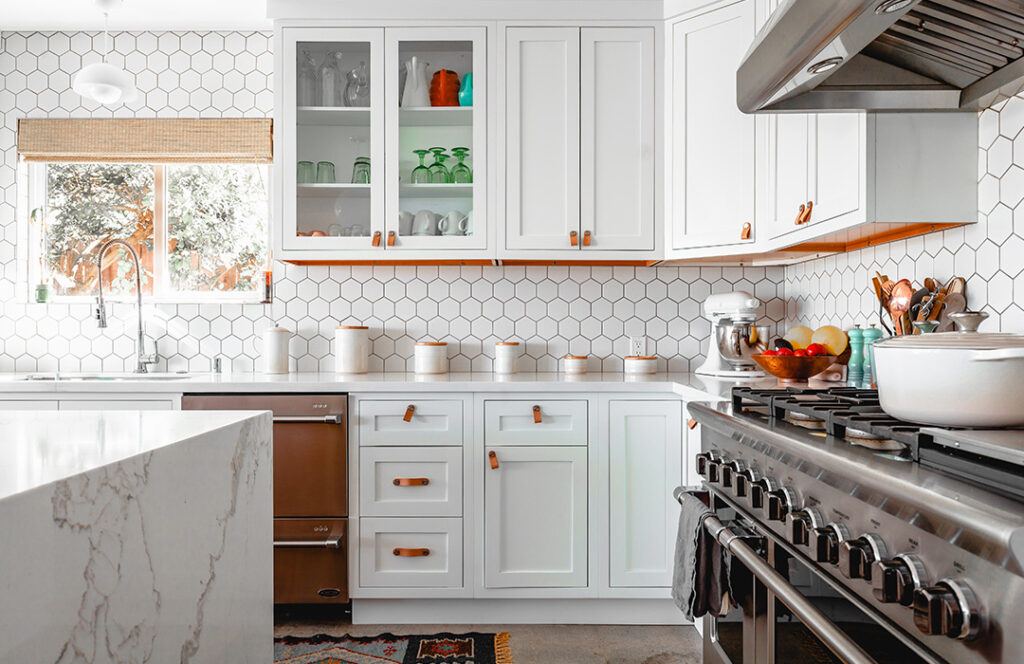
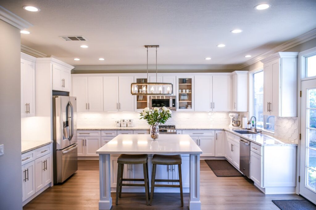
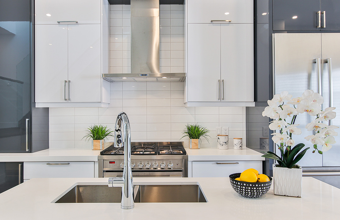
Incorporating color psychology into your kitchen design involves strategic planning to achieve the desired ambiance. Neutral colors such as whites, grays, or beige serve as versatile options that provide a clean canvas while allowing you to add pops of more vibrant hues through accessories or accent walls.
One effective way to utilize color psychology is by creating a cohesive color scheme based on your desired mood or theme. For instance, if you aim to create a cozy and inviting atmosphere in your kitchen, opting for warm earthy tones like terracotta or olive green can help achieve that goal effectively.
Pros:
- Enhances mood
- Influences behavior positively
Con:
- Overuse may lead to sensory overload
Impact of Colors on Mood and Functionality in Kitchen Design
Calmness and Relaxation
Colors play a crucial role in setting the mood and enhancing functionality in kitchen design. Blue and green hues are known for promoting calmness and relaxation, making them perfect choices for creating a peaceful kitchen environment. Imagine walking into a kitchen with soft blue walls or green accents; these colors can help reduce stress levels after a long day.
When your goal is to create a space where you can unwind while cooking or enjoying meals, incorporating shades of blue or green can significantly impact how you feel in that environment. These colors have the power to soothe the mind, providing a sense of tranquility that is especially beneficial in busy households.
- Blue and green promote calmness
- Ideal for creating peaceful environments
Appetite Stimulation and Lively Atmosphere
On the other hand, warm colors like red and orange can stimulate appetite and create a lively atmosphere within the kitchen. Picture vibrant red cabinets or an orange backsplash; these bold choices can add energy to your culinary space.
If you enjoy hosting gatherings or want to infuse your kitchen with warmth, using reds or oranges strategically can enhance social interactions during meal preparations. These colors are known for their ability to evoke feelings of excitement, making them suitable options when aiming to boost energy levels within your cooking area.
- Red and orange stimulate appetite
- Create lively atmospheres
Choosing the Right Colors for Your Kitchen Space
Consider Size for Ideal Colour Choices
When selecting colors for your kitchen, consider the size of the space. Lighter shades work well in small kitchens as they can create an illusion of more space. On the other hand, darker hues are a great choice for larger kitchens as they add depth and coziness to the room. By understanding how different colors interact with space, you can ensure that your kitchen feels just right.
- Lighter shades make small kitchens appear more spacious
- Darker hues add depth and coziness to larger kitchens
- Understanding color-space interaction helps achieve balance in kitchen design
When dealing with a smaller kitchen, opting for lighter tones like pastels or whites can open up the area and give it an airy feel. Conversely, if you have a large kitchen with ample natural light, deeper colors such as navy blue or emerald green can enhance its warmth and intimacy.
Harmonize Colors with Existing Elements
To create a cohesive look in your kitchen design, it’s crucial to harmonize new color choices with existing elements like cabinets, countertops, and appliances. A well-thought-out color palette will tie these elements together seamlessly while enhancing both mood and functionality in your cooking space.
- Harmonizing new colors with existing elements ensures coherence
- A thoughtfully curated color palette enhances overall mood and functionality
- Seamless integration of colors elevates the aesthetic appeal of your kitchen
For instance, if you have sleek stainless steel appliances or bold red cabinets already present in your kitchen, consider incorporating complementary or neutral tones that will complement rather than clash with these features. This approach ensures that every aspect of your kitchen works together harmoniously to create a visually appealing environment where you enjoy spending time cooking and entertaining guests.
Utilizing Warm Colors in Kitchen Design
Creating a Cozy Atmosphere
Warm colors such as red, orange, and yellow are perfect for infusing your kitchen with a cozy and inviting ambiance. Picture how these hues can make your space feel welcoming and comfortable, like being wrapped in a warm blanket on a chilly day. By using warm tones strategically, you can transform your kitchen into the heart of your home.
Imagine painting an accent wall in a rich shade of red or adding orange curtains to complement your neutral-colored cabinets. These small touches bring bursts of energy without overwhelming the room. Consider incorporating yellow throw pillows or tablecloths to brighten up the space, creating an atmosphere that radiates warmth.
Adding Warmth and Richness
Integrating materials such as wood or copper into your kitchen design can elevate its warmth and richness. Think about wooden cabinets or countertops that exude natural beauty while providing durability. Copper accents through light fixtures or cookware add a touch of elegance and sophistication to the overall aesthetic.
- Use red, orange, or yellow accessories sparingly
- Incorporate wood elements like cabinets or countertops
- Add copper accents through light fixtures
The Influence of Color on Appetite in Kitchen Design
Suppressing Appetite with Cool Colors
Cool colors like blue and green have been proven to suppress appetite. If you’re trying to manage your food intake, consider incorporating these hues into your kitchen design. Picture a serene sky blue or a calming sage green on your walls, cabinets, or even in smaller details like decor accents. These shades can subconsciously help curb excessive eating habits.
Using cool tones strategically is essential for those aiming to control their appetite levels without compromising the aesthetics of their kitchen space. By integrating these hues, you create an environment that promotes a sense of tranquility and calmness, which can positively impact how much one eats.
Stimulating Appetite with Warm Colors
Conversely, warm colors such as red and orange are known to stimulate appetite. Imagine the inviting warmth of a rich terracotta wall or the vibrancy of a bold crimson backsplash in your kitchen. These shades can evoke feelings of excitement and energy, encouraging people to indulge in their meals.
When designing a kitchen where you want to promote eating and create an inviting atmosphere for gatherings, incorporating warm shades strategically can be highly effective. By balancing these stimulating colors with neutral tones as the primary backdrop, you ensure that the overall ambiance remains welcoming while still inspiring appetites.
Pros:
- Cool colors suppress appetite.
- Warm colors stimulate appetite.
- Strategic use enhances mood and functionality.
Cons:
- Overusing cool tones may make space feel too cold.
- Excessive warm hues could lead to overeating tendencies.
Creating a Welcoming Atmosphere with Color in Kitchen Design
Creating a Welcoming Atmosphere
Soft and neutral colors such as beige, cream, or pastels play a crucial role in establishing a warm and inviting ambiance in your kitchen. By incorporating these hues into your design scheme, you can evoke feelings of comfort and hospitality for anyone entering the space. To further enhance this welcoming atmosphere, consider adding natural elements like plants or using earthy tones to create a sense of tranquility.
Bringing elements from the outdoors inside your kitchen can help foster a connection to nature while promoting relaxation. Imagine walking into a kitchen that features soft green accents reminiscent of lush foliage or warm brown tones resembling the earth beneath our feet. These subtle nods to nature can transform your kitchen into a tranquil environment where cooking and dining become more enjoyable experiences.
Enhancing Ambiance with Lighting
In addition to selecting the right color palette, warm lighting fixtures are essential for enhancing the cozy ambiance in your kitchen. Soft lighting can complement the chosen colors by creating an intimate and inviting atmosphere perfect for both meal preparation and gatherings with loved ones. When paired with soft, neutral colors like beige or cream, warm lighting fixtures can elevate the overall mood of the space.
Pros:
- Creates a warm and inviting environment.
- Establishes feelings of comfort and hospitality.
- Promotes relaxation through subtle nods to nature.
Con:
- May require additional maintenance when incorporating natural elements like plants.
Making a Statement with Accent Colors in Kitchen Design
Bold Accent Colors
Enhancing the mood and functionality of your kitchen design involves incorporating bold accent colors like red, turquoise, or purple. These vibrant hues can make a statement and add visual interest to your space. By selecting one or two accent colors that harmonize with the overall color scheme, you can create a cohesive look while still making an impact.
Accent colors should be used sparingly to ensure they stand out effectively. Consider integrating them through accessories such as vibrant curtains, colorful dishware, or even small appliances in eye-catching shades. Backsplash tiles are another excellent way to introduce accent colors into your kitchen design subtly yet effectively.
Complementing Your Color Scheme
When choosing accent colors for your kitchen design, it’s crucial to select shades that complement the existing palette. For instance, if your kitchen features neutral tones like white or beige as the primary color scheme, bold accents like red or turquoise can provide a striking contrast. On the other hand, if you have a more colorful base palette with shades of blue and green, opting for a complementary accent color like yellow can enhance visual appeal.
Incorporating accent colors through painted furniture pieces is another creative approach to infuse personality into your kitchen design. A brightly colored island or bar stools can serve as focal points in the room while contributing to its overall aesthetic.
Enhancing Kitchen Attributes with Strategic Color Schemes
Highlighting Specific Features
Strategic color schemes play a vital role in enhancing various attributes of your kitchen. By using contrasting colors, you can draw attention to specific features like an island or a focal point wall. For instance, painting the island in a bold color while keeping the surrounding cabinets neutral creates a visual focal point that adds character to the space.
Incorporating different colors strategically can also help emphasize architectural details in your kitchen. Imagine highlighting intricate crown molding or unique cabinet hardware by selecting colors that make these elements stand out. This approach not only enhances the aesthetic appeal but also showcases the craftsmanship and design elements within your dream kitchen.
Creating Illusions of Space
Consider how colors can impact the perception of space. Lighter shades have the ability to make a low-ceilinged kitchen appear taller and airier, creating an illusion of more vertical space than actually exists. On the other hand, darker hues can add depth and coziness to high-ceilinged spaces by visually lowering the ceiling height.
Evoking Emotion Through Color Combinations in Kitchen Design
Balancing Warm and Cool Colors
Creating a balanced color palette in your kitchen design can significantly impact the overall mood of the space. By combining warm tones like reds, yellows, or oranges with cooler shades such as blues or greens, you can achieve a harmonious and visually appealing look. This blend of colors not only adds depth but also evokes different emotions within the room. For instance, incorporating vibrant colors like red can bring energy and excitement to the kitchen, while cooler hues like blue create a calming and serene atmosphere.
When experimenting with color combinations, consider using complementary pairs to enhance visual interest. Combining opposites on the color wheel such as blue and orange or yellow and purple creates a striking contrast that adds dynamism to the space. These bold choices inject personality into your kitchen design while maintaining a sense of harmony through thoughtful pairing.
Monochromatic Schemes for Cohesive Designs
For those seeking a more subtle approach to color theory in kitchen design, monochromatic schemes offer an elegant solution. Utilizing varying shades of a single color creates a cohesive look that exudes sophistication and simplicity simultaneously. Whether opting for different tones of brown for warmth or various shades of gray for modernity, monochromatic palettes provide an excellent canvas for showcasing other elements in your kitchen.
In addition to their aesthetic appeal, monochromatic schemes have practical benefits too. They make spaces feel larger by eliminating visual clutter caused by multiple colors competing for attention. Furthermore, these soothing designs promote relaxation within the home environment—ideal for creating an inviting space where family gathers.
Conclusion
You’ve now delved into the vibrant world of color theory in kitchen design, understanding how hues can influence mood and functionality. By choosing the right colors and strategically incorporating them into your kitchen space, you have the power to create an atmosphere that not only stimulates appetite but also fosters a welcoming ambiance. Remember, color is more than just a visual aspect; it’s a tool that can evoke emotions and make a statement in your kitchen design.
As you embark on your kitchen design journey, consider the impact of colors on every detail. Play with warm tones, experiment with accent colors, and craft harmonious color combinations to enhance your kitchen’s attributes further. Let color be your ally in transforming a mere cooking space into a culinary haven that reflects your personality and style. Your kitchen’s potential is limitless when painted with the brush of thoughtful color choices and combinations.